Introduction
Visual hierarchy is a design principle that has shaped communication long before the internet. Originating in print media, it has played a fundamental role in defining how information is structured across newspapers, posters, advertisements, and nearly every other designed medium. Designers have long used techniques such as contrast, spacing, and typography to guide the viewer’s eye and ensure key messages stand out.
While websites (and by extension, UI design) exist in an entirely different medium, the core principles of visual hierarchy remain just as important. However, many beginner web designers – particularly those without a background in traditional design practice – tend to overlook these fundamentals. This often results in cluttered, confusing, or ineffective designs that fail to engage users.
Without a well-structured visual hierarchy, websites can feel overwhelming and frustrating to navigate. In this post, we’ll explore why visual hierarchy matters in web design, highlight common mistakes, and share best practices to create clear, engaging user experiences.
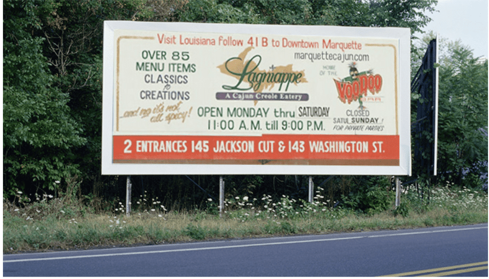
Some terrible examples of visual hierarchy.
So, What is Visual Hierarchy?
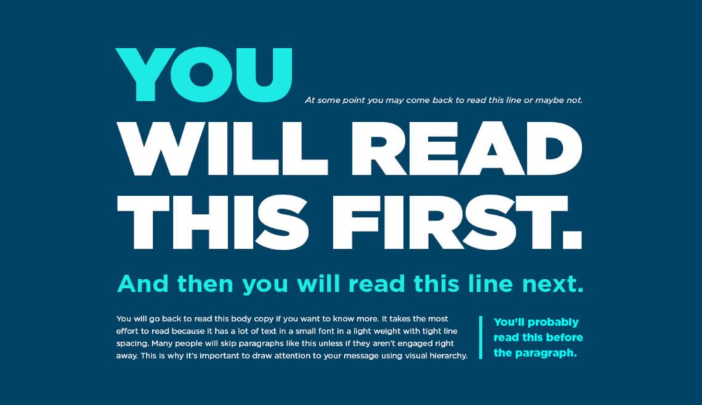
Visual hierarchy is the arrangement of elements on a webpage in order of importance. It influences how users perceive and interact with content, ensuring that the most critical information stands out. This is achieved through factors like size, colour, contrast, spacing, and typography.
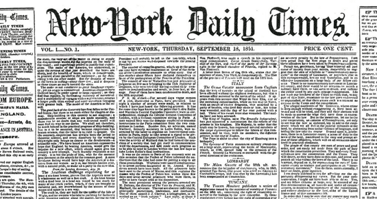
Think of a newspaper: the headline is bold, large and often in a unique font. Subheadings are slightly smaller, and body text is the smallest. This natural flow of information makes it easy for readers to digest content efficiently. The same principle applies to web design.
Why is Visual Hierarchy Important?
- Guides User Attention
Users don’t read websites like books – they scan for relevant information. A strong visual hierarchy ensures users find what they need quickly and effortlessly. - Improves Readability
Proper text sizing, line spacing, and contrast make content easier to read. When information is clear, users are more likely to stay on your site longer. - Enhances User Experience (UX)
A well-structured layout makes navigation intuitive, helping users complete actions with minimal friction (e.g. making a purchase or signing up for a newsletter). - Increases Conversions
By directing attention to key CTAs (Call-to-Actions), such as “Buy Now” or “Get Started,” visual hierarchy plays a crucial role in boosting conversions. - Reduces Cognitive Load
Websites with poor visual hierarchy force users to work harder to process information. A clean, structured design helps reduce mental effort and doesn’t frustrate your users.
Key Elements of Visual Hierarchy
- Size & Scale
- Larger elements draw more attention than smaller ones.
- Headlines should be significantly larger than body text.
- Important CTAs should be prominent and not blend in with surrounding content.
- Color & Contrast
- Bright or bold colours attract attention.
- High contrast between text and background enhances readability.
- Important buttons (e.g. “Sign Up”) should stand out from less critical elements.
- Typography & Font Weight
- Use different font sizes and weights to create a hierarchy.
- Avoid using too many fonts—stick to 1-2 complementary typefaces with a variety of weightings.
- Spacing & White Space
- Proper spacing helps separate sections and prevents clutter.
- White space around key elements makes them more noticeable.
- Crowding too much information together reduces scannability.
- Alignment & Placement
- The position of elements on a page affects their perceived ‘importance’.
- Key messages should be placed above the fold (visible without scrolling).
- Users tend to scan in an “F” or “Z” pattern, so design layouts accordingly.
Common Mistakes in Visual Hierarchy (and How to Fix Them)
Mistake #1: Everything Looks the Same
Fix: Use size, colour, and contrast to differentiate elements. Headlines should be bold and larger than body text, and buttons should be clearly distinct from other UI elements.
Mistake #2: Too Many Competing Elements
Fix: Reduce clutter and prioritise key content. Remove unnecessary elements and use white space effectively.
Mistake #3: Low Contrast Between Text and Background
Fix: Ensure sufficient contrast to improve readability.
Mistake #4: Weak CTA Placement
Fix: Place CTAs where users naturally look – above the fold and in high-engagement areas (like the end of a page or near key content).
Mistake #5: Inconsistent Typography
Fix: Stick to a limited set of fonts and use them consistently. Define a clear heading hierarchy (H1, H2, H3) to organise content.
Best Practices for Implementing Visual Hierarchy
- Follow the “One Main Focus” Rule – Each page or section should have one clear focal point (e.g. a product, service, key message, CTA).
- Use the 60-30-10 Rule for Color – 60% background, 30% secondary elements, 10% accents (such as action buttons).
- Make Use of Grids & Alignment – Grid layouts help maintain structure and balance.
- Test with Real Users – Conduct usability tests to see where users focus their attention.
Conclusion
Visual hierarchy is easy to grasp but difficult to master. While its principles are straightforward (and picking out bad visual hierarchy is very easy), applying them effectively requires experience and a deep understanding of user behaviour. Thankfully, Simple Pixels specialises in UX-focused web design that enhances engagement and conversions – so you don’t have to spend your valuable time figuring it out. If you’d rather focus on growing your business while ensuring your website is designed to perform, get in touch today. Otherwise, happy designing – and remember, practice makes perfect!