ABOUT THE BRAND
CareTick was built on a simple but powerful belief – that care should never be shadowed by doubt or confusion. Through simple, wearable technology, CareTick gives participants, families, and NDIS managers the tools to track provider shifts, deter misuse, and make every care dollar count.
MISSION
Our mission is to bring clarity, fairness, and peace of mind to every moment of care.
STRATEGIC DECISIONS
Simple & Clean:
Symbolism
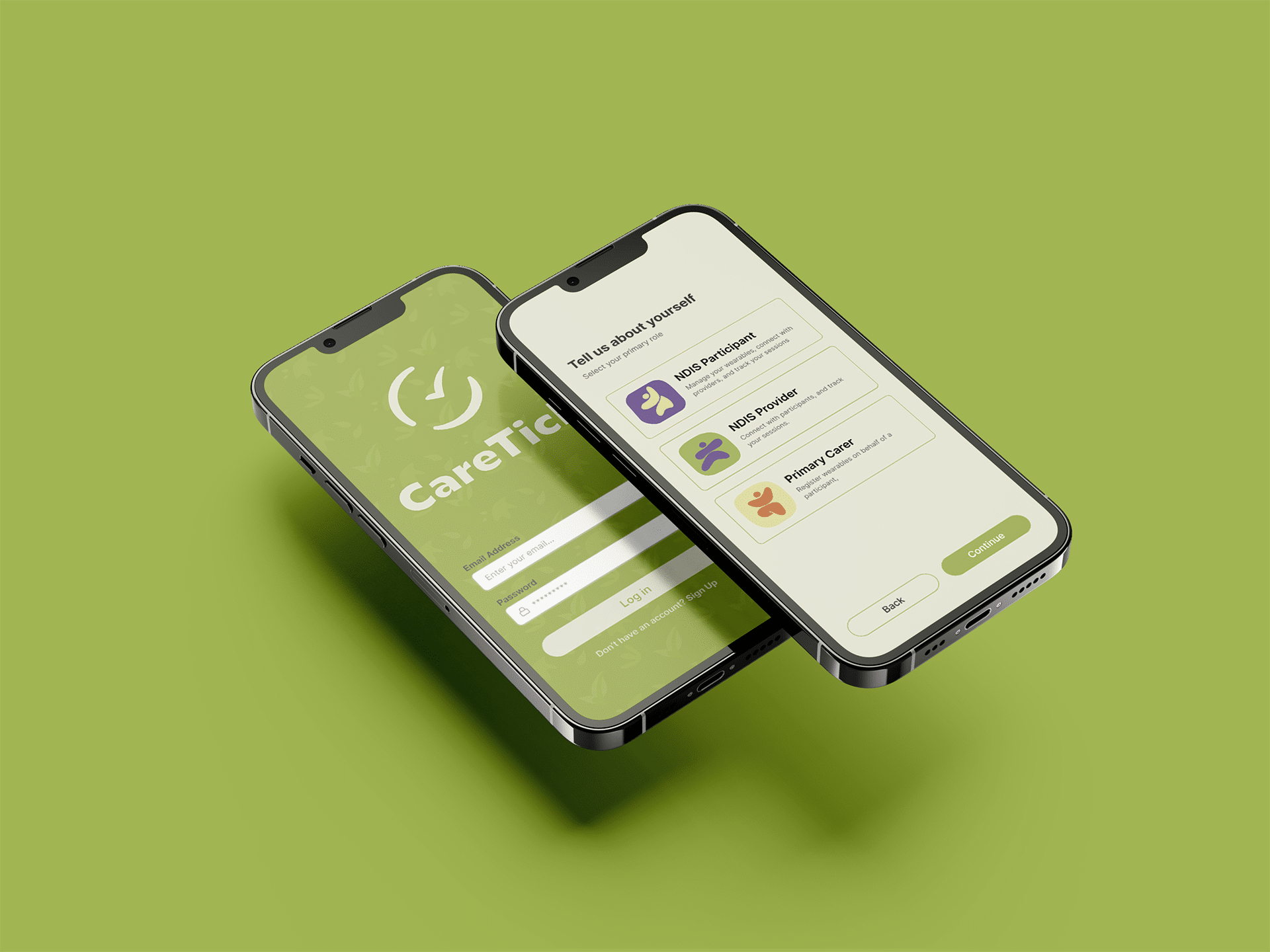
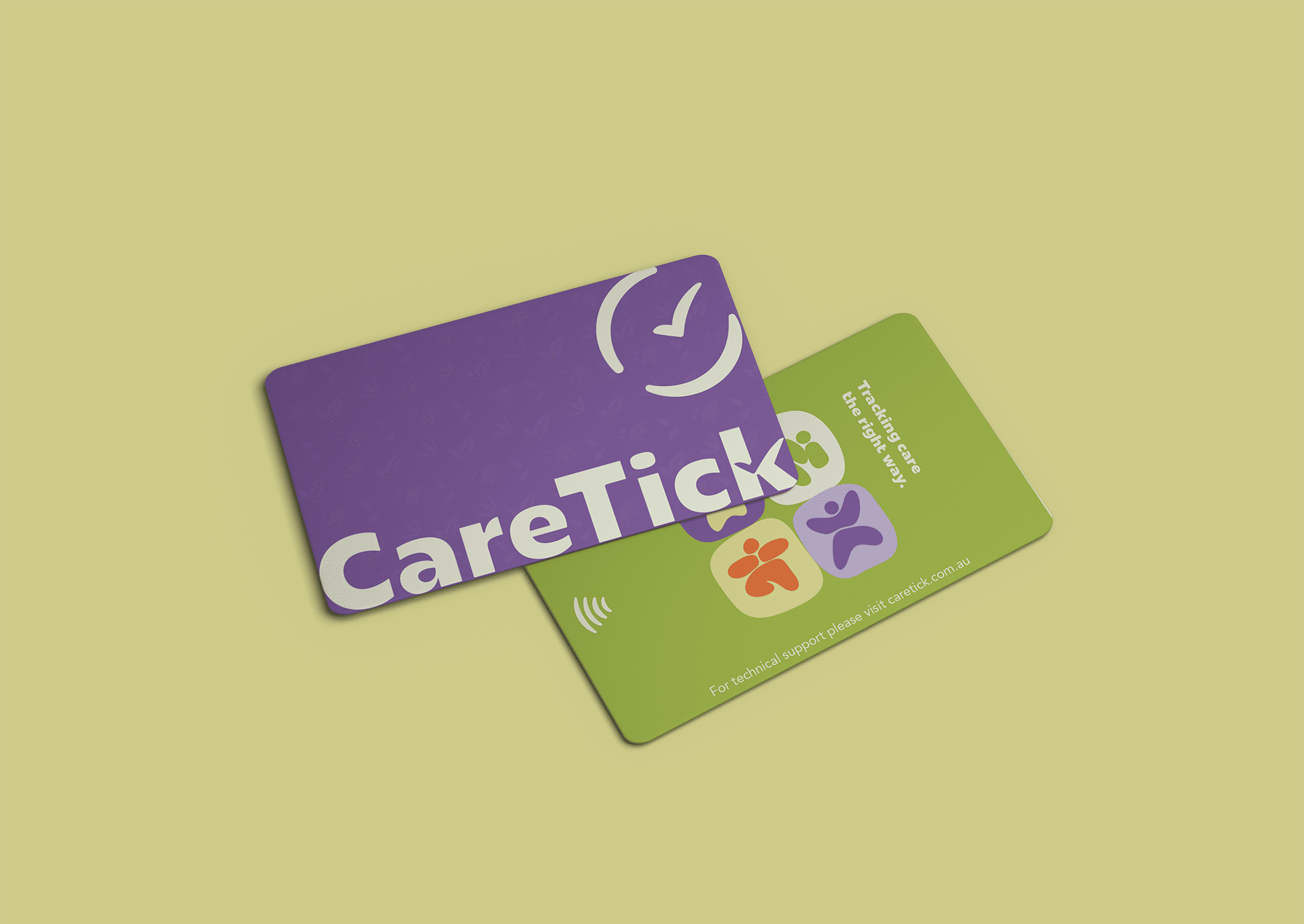
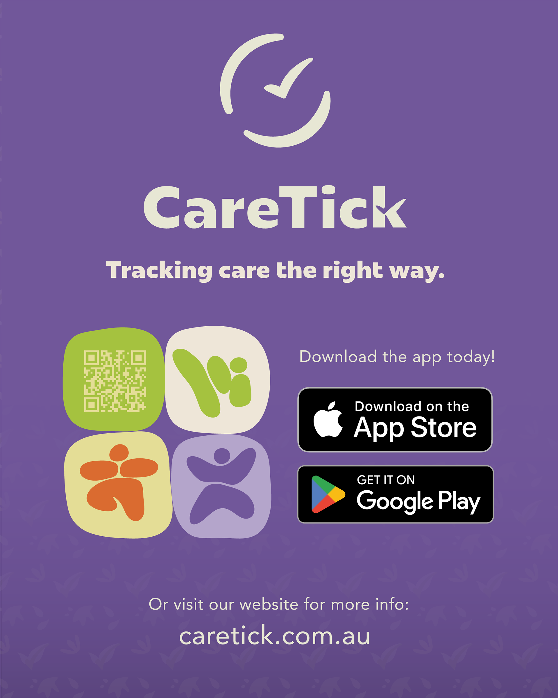
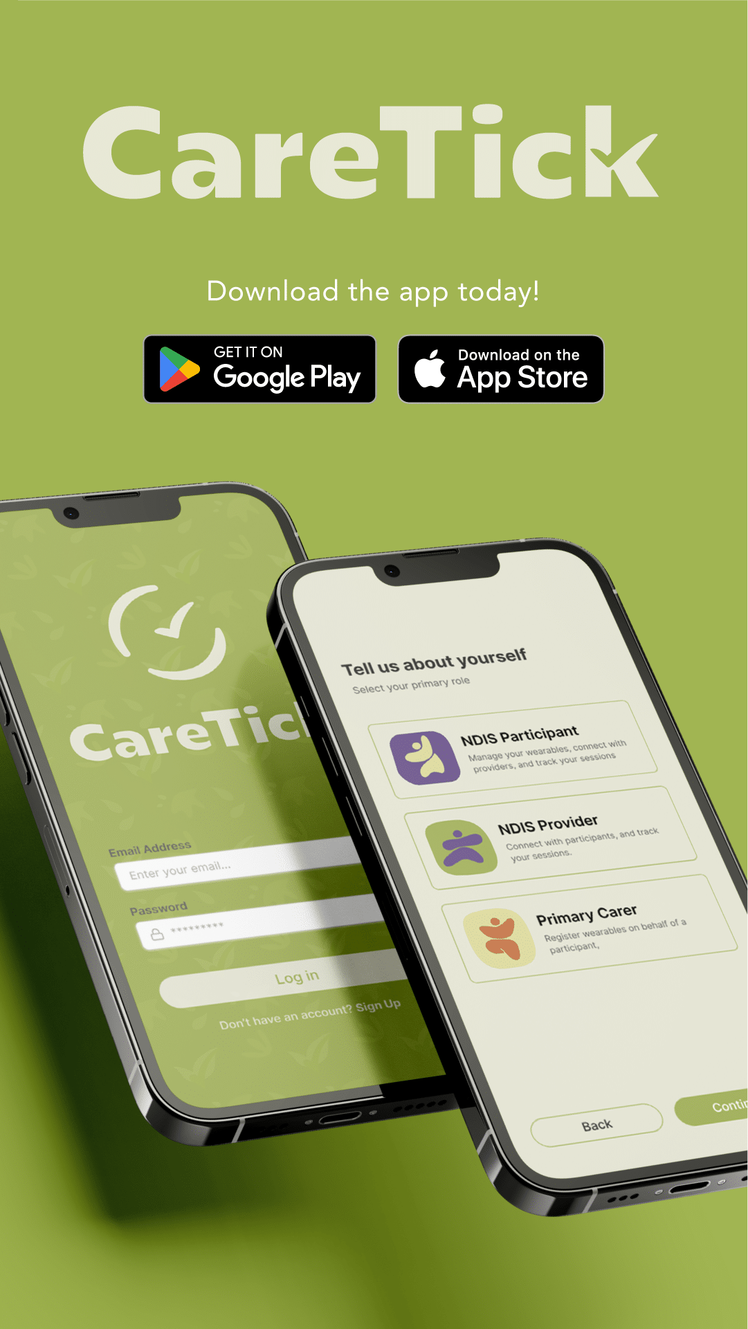
The CareTick logo is made up of two very intrinsic symbols: a clock, and a tick. Together these give faith to the idea that the apps main function, time tracking, is done correctly and effectively.
Gentle Nature
One of the primary components behind CareTick is that the app is derived from a want to help, nurture and care for those who are being taken advantage of. By softened the design in shape and colour we create an environment that feels warm and gentle.